Resume
MSU Tech Store
Project Overview
The Challenge
The MSU Tech Store was faced with challenges that left them confused. Their web traffic has steadily decreased over the past couple of years, and they weren't getting as many customers to come in their physical store. In a team with 3 others, my team and I were asked to tackle these challenges by focusing on creating an online and in-store experience that would guarantee change for the MSU Tech Store and its users.
My Role
UX Designer, User Researcher, Physical Space Designer
Deliverables and Technique
Interviews, surveys, usability tests, IA, wireframes, user flow charts
What is the MSU Tech Store?
The MSU Tech Store is a technology store on Michigan State's campus that provides departmental, faculty, and students with an assortment of tech pieces - from computers and tablets, to headphones, chargers, and gaming devices. Staff members also provide tech help to those that are having technical difficulties with their devices.
Understanding the Problem
We broke up this project into 3 separate issues that needed to be addressed: the website, the physical store, and outreach methods.
-
We focused on the website because the MSU Tech Store relied heavily on its site to sell products, but wasn't receiving much web traffic. We focused on user navigation and usability to understand why users weren't visiting the website as much as previous years.
-
We focused on the physical store because we understand that a store's design gives off a certain experience to its users. We needed to evaluate what current experience and feeling the store was giving off, and how we could design it differently to create a true Spartan experience the store needed.
-
Lastly, we focused on outreach methods because, as we dove into research and understanding our users' perception of the MSU Tech Store, we began to understand that users weren't familiar with the services MSU Tech Store provides. Therefore, we needed to create a marketing technique that would get their name and services out to the Spartan community.
The Website
To become familiar with MSU Tech Store's website, my team and I analyzed the site to discover any possible pain points, understand the information architecture, and review the aesthetic that is presented to the users. After collecting our initial thoughts and ideas, we conducted user research to gain perspectives from students and faculty.
Student Usability Test:
We conducted usability tests with current students to understand any pain points they might experience. We asked them to complete the task of finding a specific device on the website without using the search bar. The responses and think aloud technique users participated in included:
-
"Wait...still no results?"
-
"Should I select student use?"
-
"Even when I go to the computers tab and search, I still don't get laptops."
Departmental Interview:
My team member was able to talk to a departmental member about their experience with the website, and the member voiced a similar response: the search bar was defective, and selecting the "type of use" button was irritating to select every single time something is searched.
Usability Test and Interview Takeaways
-
We discovered that the search feature on the site gave inaccurate results. Students couldn't find what they were looking for, when the product they searched for was actually available on the site.
-
The messy and cluttered IA of the site confused users. The repetitive list of devices felt odd to users.
-
The requirement to consistently select the type of use (departmental use, faculty use, or student use) frustrated users.
The Research

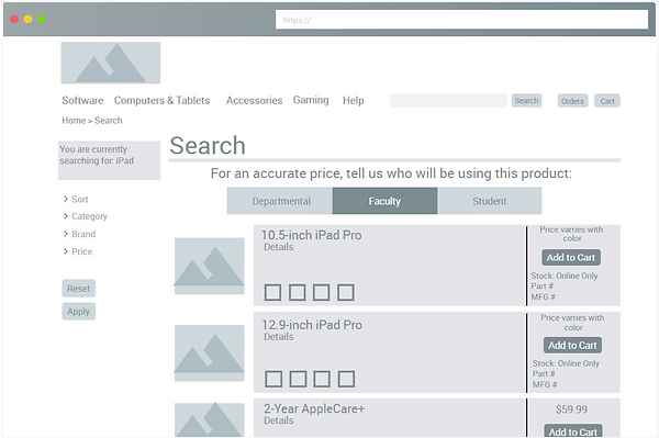
Cluttered IA with repetitive content; same Ipad is listed, just in different colors.

The "type of use" filter was irritating to select every time something was searched. Additionally, the search feature is inaccurate, as the site displays "No Results Found" after a user searched a device that the website has listed for sale.
Our Website Deliverable
The wireframe we created clears up a few things:
-
Instead of requiring the user to select their type of use (student, faculty, or departmental) each time they search for a device, our mockup requires users to only select their type of use once when visiting the site. This selection is then applied to all searches.
-
It removes the cluttered and repetitive list of devices. Instead, it lists the device once, with color options shown within the product description.
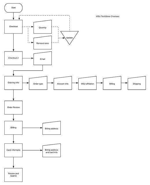
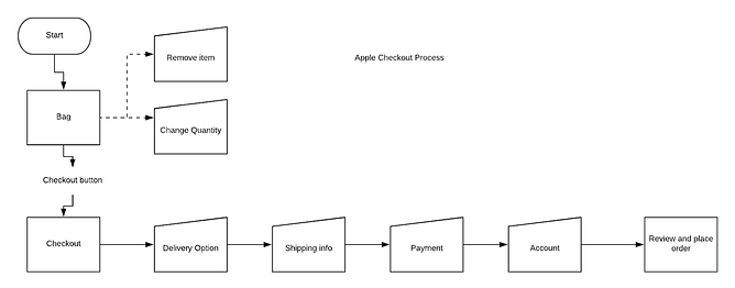
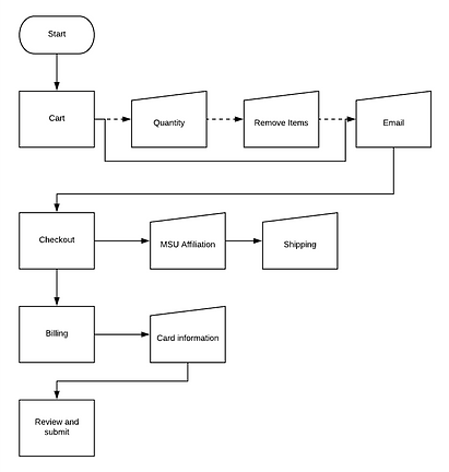
Additionally, we discovered later on how tedious the check-out section was, and how it could possible drive users away before hitting "submit purchase". We created a user flow diagram to show just how tedious it is, and then compared it to Apple's checkout section to show a more simplified, user-friendly version.
MSU Tech Store Checkout
Apple Checkout
Our Checkout Proposal
The Store
The MSU Tech Store struggled with bringing in customers to their physical store. My team and I visited the store to understand why they were faced with this problem, and what we could do to help tackle the problem. A challenge we were presented with was that the Tech Store may be moving to a different location with an unknown floor plan, and there was very little in their budget for a drastic interior design change. Therefore, we focused on minor design proposals that could work in both spaces for a minimal cost.
The Research
The Store Walkthrough
We visited the store to become familiar with the design of it. We noted the organization of items, the flow and navigation of the store, and the interior design choices. We found that:
-
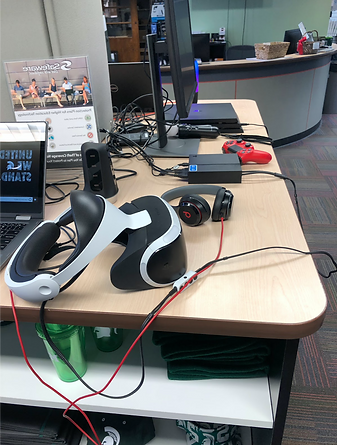
The organization of items: cluttered and unprofessional looking. Wires were everywhere, labels were missing for items, and there was no coherent or clear way of organization of devices making it challenging to locate items.
-
The flow and navigation of the store: awkward; no clear path of navigation.
-
The interior design: cheap and unprofessional looking that didn't match the website's look. The space wasn't used to its full potential.
Interviews with Store Employees
We interviewed MSU Tech Store employees to gain an understanding on their thoughts of their work environment. They vocalized that:
-
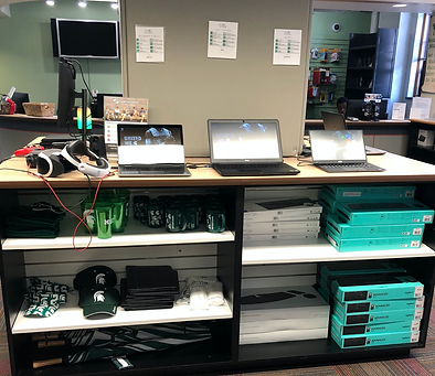
The unrelated gear (backpacks, hats, cups) needs to be removed to optimize more space for tech gear.
-
The main service students call about is fixing cracked phone screens.
Our Store Deliverable
Due to the fact that the MSU Tech Store may be relocating, and there is little in their budget for drastic interior design change, we gave verbal suggestions:
-
Focus on interior design changes that are brand coherent with the website.
-
Keep colors coordinated.
-
Organize in-store items in the same manner as the IA of the website is organized.
-
Improve the wayfinding of the store. Design the structure of the store in an intentional manner that provokes customers to travel through the store in a certain way, without them knowing they are doing so. The store should be set up with flow, guiding the customers without a prohibitive structure. This flow that is created will generate a better shopping experience, and reduce the cause of a hectic and dysfunctional one.
-
Maximize natural light. With the store having such low ceilings, open the space up with natural light to create a more welcoming feeling.
-
-
Improve labeling and organization of items.
-
Clear up desk space to give a cleaner look.
-
Reduce wire clutter. If possible, drill holes in the desks to store wires under the desks' surfaces.
-
Create cleaned-up, simplistic labeling. The current labeling is hard to read due to small type and too much information on a single piece of paper.
-
-
Include more relevant stock in the store.
-
Backpacks, hats, cups, mugs, folders are unnecessary if more space is needed for tech-related gear. Because the current organization of items is unclear, as there are headphones, VR devices, game controllers, and laptops organized side-by-side with each other, eliminating non-tech gear can optimize more space for organization of tech-related gear.
-
If continuing to sell non-tech gear is preferred, keep such items in a total separate section from the tech-related gear.
-
-
Consider including services that fix phone screens. The MSU Tech Store is an Apple licensed store, so this service may be worth looking into, considering students call about this service.
The Outreach Methods
The other concern we addressed was how the MSU Tech Store can increase audience. We chose to target 2 audience groups in our research, incoming freshmen and current students, considering these 2 audience groups are realistic and ideal for the MSU Tech Store.
The Research
Freshmen Survey
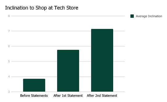
Many freshmen come into college needing to buy an array of new technology pieces. We conducted a survey with freshmen from the East Lansing High School, where we asked them to rate their inclination to purchase anything from the MSU Tech Store after 2 statements:
-
First Statement: The Tech Store is an Apple licensed seller, so any product you would find in the Apple Store, you would also find here.
-
Second Statement: The Tech Store offers packages based off of your major, so you can get all the required programs and products.
The results are as followed:
-
Students became more inclined to shop after reading these statements.
Current Students Survey
We came up with some potential marketing strategies for the MSU Tech Store to adopt. We tested our strategies with current students, asking them questions via a survey to understand:
-
If their major has tech requirements to provide validation for a hypothetical website feature, where there are major-related tech packages offered on the site.
-
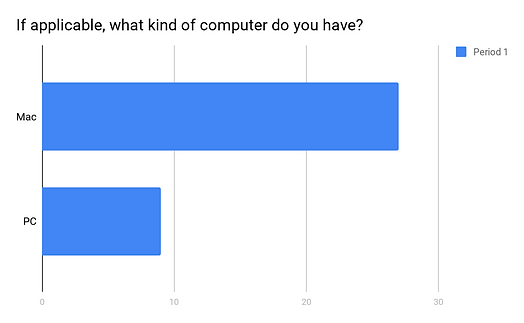
What brand computer current students own, to understand if MSU Tech Store's Apple Services could be helpful.
-
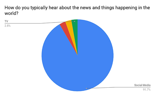
How they typically hear about news happening in the world, to understand what platform to market on.
The results:
1.

2.
3.
Our Outreach Method Deliverable
After we tested our ideas for marketing strategies and gained feedback, we encouraged the MSU Tech Store to consider and implement the following:
-
Packages
-
What: Offer packages that are catered to students' majors. These packages will consist of a list of expected technology requirements by major. To achieve this packaging feature, collaborating with Board members of majors at MSU is essential.
-
Why?: Based on the surveys we conducted, freshmen are more inclined to purchase from the Tech Store with this feature, and many current students know their major has technology requirements.
-
This feature is designed to make the users' website and in-store experience more helpful based upon their needs. It will help ease the stress of students, introducing freshmen and current students to their majors' required tech gear, eliminating the stressful factors of not knowing what to purchase, and the feeling on unpreparedness for classes.
-
-
Apple Licensed Store
-
What: Advertise that they are an Apple Licensed Store.
-
Why?: Based on the surveys we conducted, freshmen are more inclined to purchase products from the Tech Store with knowledge about the Apple Licensing feature, and the majority of MSU students state they have Apple laptops.
-
This connects the Apple experience with the MSU Tech Store experience.
-
-
Social Media Presence
-
What: Have a social media presence. We suggest creating a Twitter and Snapchat account to stay connected with students and up to date with the applications they are engaging with.
-
Why?: 92% of students we surveyed stated they hear news from social media.
-
A social media presence is catered specifically to the type of medium students use, enabling students to cross the MSU Tech Store's Twitter or Snapchat account more likely. The MSU Tech Store can bring students information more easily, as well.
-
-
Advertise Physical Store
-
What: Create stepping stone stickers on campus sidewalks that lead students to the MSU Tech Store. Stepping stones should be placed around the general area of the store. It will help students become familiar with the location of the store based upon a tangible experience.
-
What: Create a more dominant sign that clearly labels the MSU Tech Store on the building the store is located in. There is no current sign other than a poster mounted on the sidewalk, that is easily missed.
-
Why?: Talk of students generally being unfamiliar with the location of the store.
-

Lessons Learned
-
Designing an interior space with no to little budget, and the possibility of the store moving to a different location without knowing what the layout of the space looks like, is a big challenge to take on. Because the store's budget wasn't manageable for a full interior redesign, it was important that my team and I find alternative and budget-friendly ways to offer a better in-store experience with better design. I learned that although we understood there was little to no money to invest in the space, sitting down with the MSU Tech Store's management team to further understand the extent of this would have been beneficial, and could have opened doors to new and different ideas.
-
Emphasizing how our ideas and suggestions can provide a better experience for customers in the MSU Tech Store's digital and physical spaces is a must. Taking the client through the journey of the initial ideas, the research, and the execution is vital for helping the client to see what we see, and how our ideas will guarantee positive change.
-
Setting a plan, timeline, and goal is important in a team environment. Communication is vital to implement these; assigning tasks to each team member to ensure the job gets done in a timely manner is important, as well as ensuring everyone on the team is on the same page and understands the problem and goal at hand. Check-in's with each other's work is important to provide feedback and help guide each other. I believe my team and I executed our timeline, plan, and goal well, and consider this project a great team effort experience.